
PhD Visit Day App
Date: March 2023 - May 2023
Tags: user interviews, affinity diagramming, card sorting, persona creation, wireframing, app design, app development, task scenarios, user testing, rapid design, WCAG
App: PhD Visit Day App
Cornell University hosts an Information Science PhD Visit Day for prospective PhD candidates to visit campus and learn more about the PhD program, research and more. Cornell wants to create an app for prospective candidates to ease their Visit Day experience. I worked in a team of five undergraduate designer/developers to tackle this challenge.
Research
Our intended audience are 👩🎓 prospective PhD students and want to participate in PhD Visit Day. 🏫
We conducted five semi-structured interviews
to gather information about the PhD Visit Day from participants’ perspectives and consolidated key points from each user interview by creating an affinity diagram to identify common themes.

User Interviews
Their main reasons for attending Visit Day were to:
🧠 learn more about the PhD program
🤝 meet community members
tour campus and the labs
The majority of interviewees, especially those whose Visit Days were online, felt a lack of opportunities to socialize and wished they were able to chat more with fellow prospective students and current students. 🥺
Many identified their favorite aspect of Visit Day as being able to talk 1-on-1 with faculty or current students. 🤩
Users were overwhelmed with itineraries that were sent through email with various links for different online meetings and scheduling. 😵

User Goals
Prospective IS PhD students want to:
✅ have opportunities to meet and talk to other prospective PhD students and current students who are interested in similar research areas
✅ learn more about Cornell’s IS PhD program, research areas, and professors, as well as its campuses and facilities
✅ easily locate information on event descriptions, locations, and logistics of their Visit Day itinerary
✅ have easy access to reimbursement for their PhD Visit Day expenses
Persona

Sarah is a prospective PhD student who is searching for a university program that matches her research interests.
Her most important considerations when it comes to choosing a PhD program are an advisor with matching research interests, funding, and good relationships between PhD students and faculty in the department.
She wants to attend the PhD Visit Day to learn more about Cornell’s program and hopes to be able to talk to academic cohort, from faculty to current PhDs to other prospective students.
Cornell’s Visit Day will be the first she attends, so she’s not sure what to expect and how to go about her schedule and finding people to talk to. Sarah’s goal is to have an informative experience that will help inform her final decision.
Task Scenarios
✅ Goal 1: Prospective PhD students are interested in social opportunities so they can meet and talk to other prospective students, PhD student volunteers, and faculty in similar fields.
📋 Task Scenario 1: Sarah is a prospective PhD student planning to attend Cornell’s InfoSci PhD Visit Day. She wants to get in contact with some current PhD students to discuss research opportunities. Her prospective advisor recommended her to speak to a student named Henry Waver, so she uses the Visit Day app to find his contact information.
✅ Goal 2: They want to learn more about Cornell’s campus as well as more about its labs, research and professors.
📋 Task Scenario 2: Sarah is a prospective PhD student who is looking to do research at a university. Sarah has never been to Cornell University, but is planning to attend Cornell’s Information Science PhD Visit Day and wants to explore what types of research are available. Sarah finds the names and locations of the labs she is scheduled to tour.
✅ Goal 3: Users want to easily locate information on event descriptions, locations, and logistics of their Visit Day itinerary.
📋 Task Scenario 3: Sarah is a prospective PhD student who is looking to do research in InfoSci at Cornell University. She is attending the InfoSci Visit Day and needs to know her schedule during her time at Cornell. Sarah is especially interested in doing research with Phoebe Sengers, and uses the Visit Day app to check when she is meeting with her 1-on-1.
✅ Goal 4: Users want easy access to reimbursement for their PhD Visit Day expenses.
📋 Task Scenario 4: Sarah is a prospective PhD student attending PhD Visit Day and is traveling from San Francisco, California via airplane. She bought her airplane ticket for $500 on April 27 and wants to be reimbursed for it. She adds the expense details to her expenses list on the app.
Design
We decided the grouping of components by card sorting and started sketching our main views.


First iteration
Second iteration
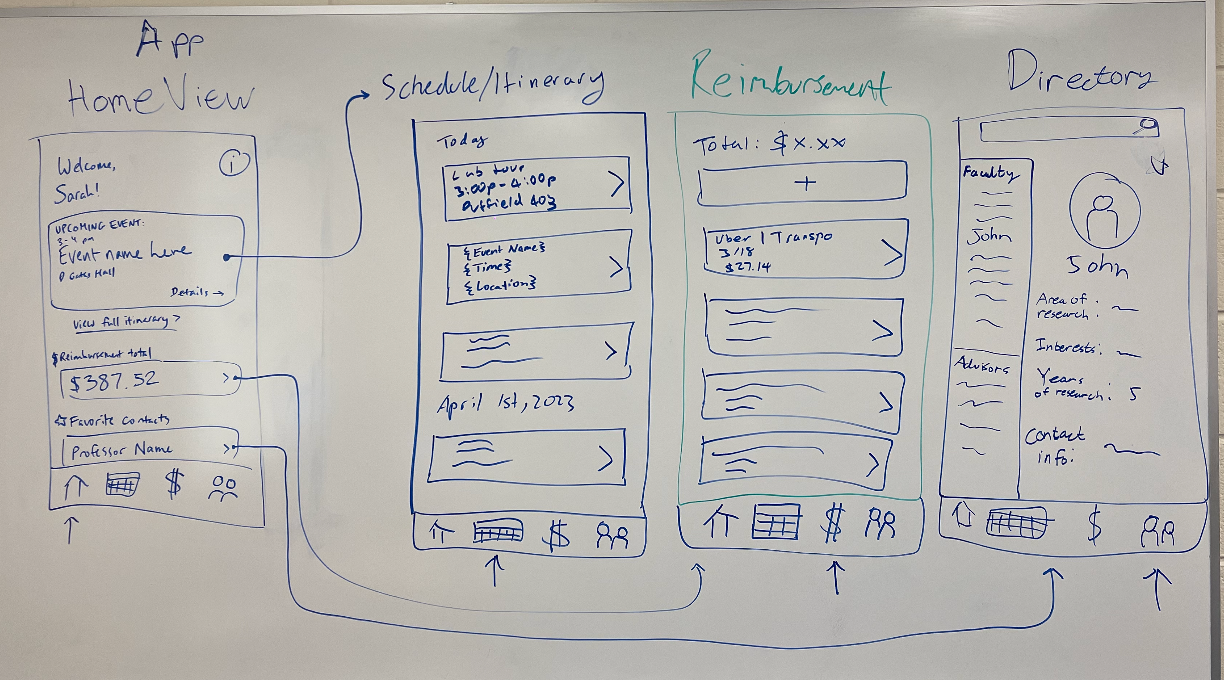
User’s full schedule for the visit days, organized by day. Each event is represented by a card showing the event name, time, and location; each card can be clicked to view details for that event.
Itinerary View

This is how users communicate with professors that they’re interested in or deal with their field of interest. We decided that more filters were needed, such as faculty and advisors in order for users to more quickly find what they needed.
Directory View


Development


The first page the user will see when they open the app. It contains key information: the next event on their itinerary, reimbursement information, and their favorite contacts. Each section contains a link that leads to more details.
Home View

Allows the user to track expenses to be reimbursed. They can add each expense (e.g. plane ticket), and the app will calculate their running total. This allows the user to easily keep track of expenses to be reimbursed.
Reimbursement View


We implemented a prototype using BootstrapVue and Visual Studio Code. We published a mobile Progressive Web App, collaborating through GitHub.
Evaluation
Clarity & Navigation
User testing confirmed that our app is intuitive, self-explanatory, and easy to navigate. All participants were able to complete their tasks with minimal hesitation or confusion. Key interactions included:
✅ Navigating the Directory to find specific contacts (Task 1)
✅ Moving through the Itinerary to locate event and meeting details (Tasks 2 & 3)
✅ Adding an expense to their Reimbursement total with ease (Task 4)
These results indicate a strong foundation in usability and a smooth overall user flow. Despite the app’s success in supporting core tasks, user feedback revealed a few design challenges
Navigation Icon Confusion
Some users had difficulty identifying the icons in the bottom navigation bar:
“I think this calendar icon is the schedule…”
This suggests a lack of clarity in icon meaning. To improve this:
We propose making text labels permanently visible below each icon (e.g., Home, Itinerary, Directory, Reimbursement), rather than only appearing when selected.
Styling & Consistency
Users also noted that the visual styling felt slightly inconsistent across the app. Suggestions included:
More cohesive color and typography choices
Consistent spacing and element alignment
Refining the visual rhythm for better readability
These are polish-level improvements that can help the app feel more refined and professional.
Feature Requests & Enhancements
Testers expressed interest in additional features to boost functionality and usefulness:
📍 Google Maps integration for event locations
📝 Ability to take notes on individual events
👤 Display event organizer contact info directly within the itinerary
These insights help us prioritize feature development that aligns with real user needs.
Conclusion
User testing validated our core design:
✔️ The app enables users to complete key tasks quickly and confidently.
⚙️ With a few refinements to navigation clarity, styling consistency, and feature depth, we’re well on our way to creating an even stronger, more delightful experience.